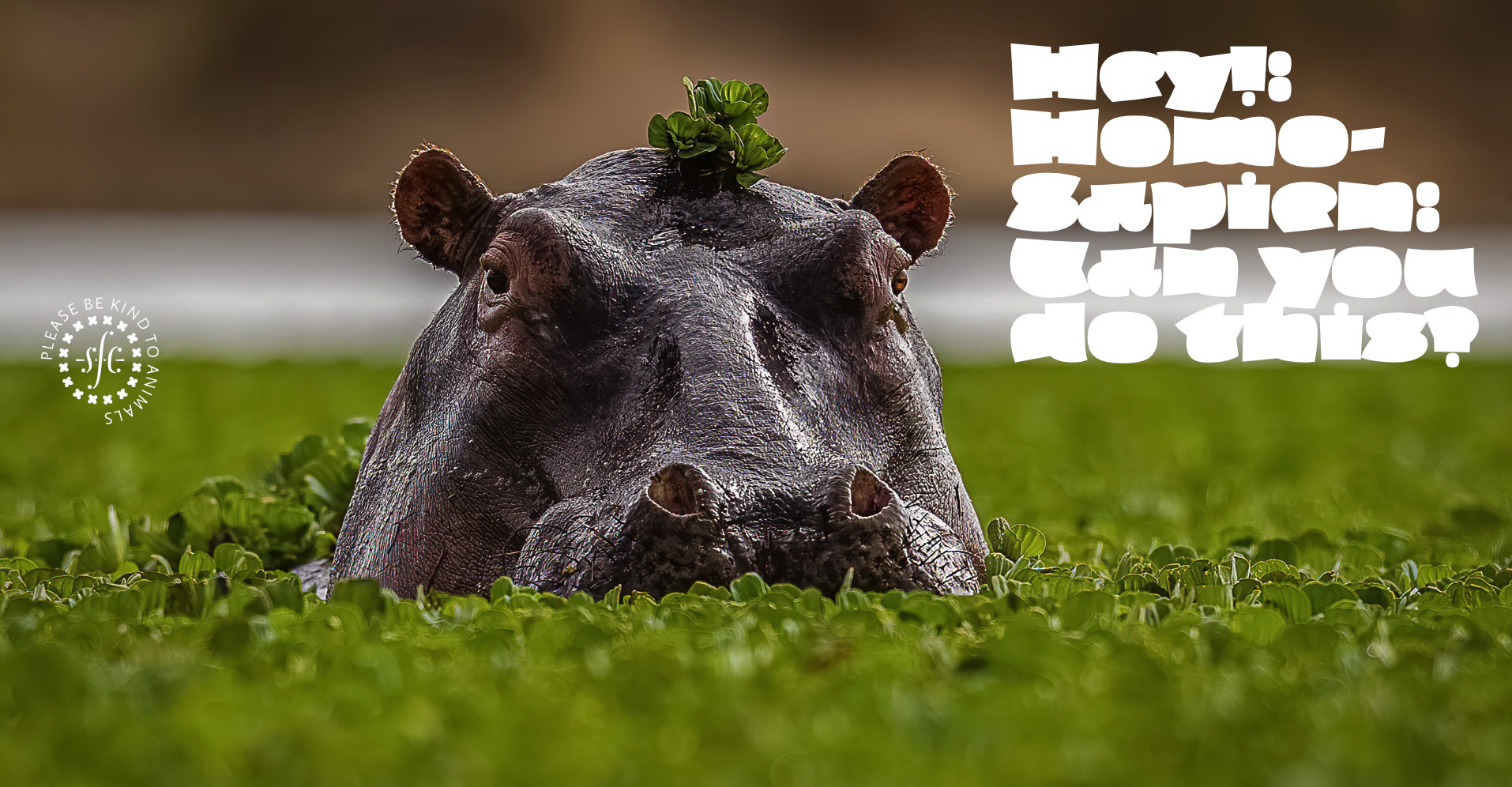
Hipsterpotamus


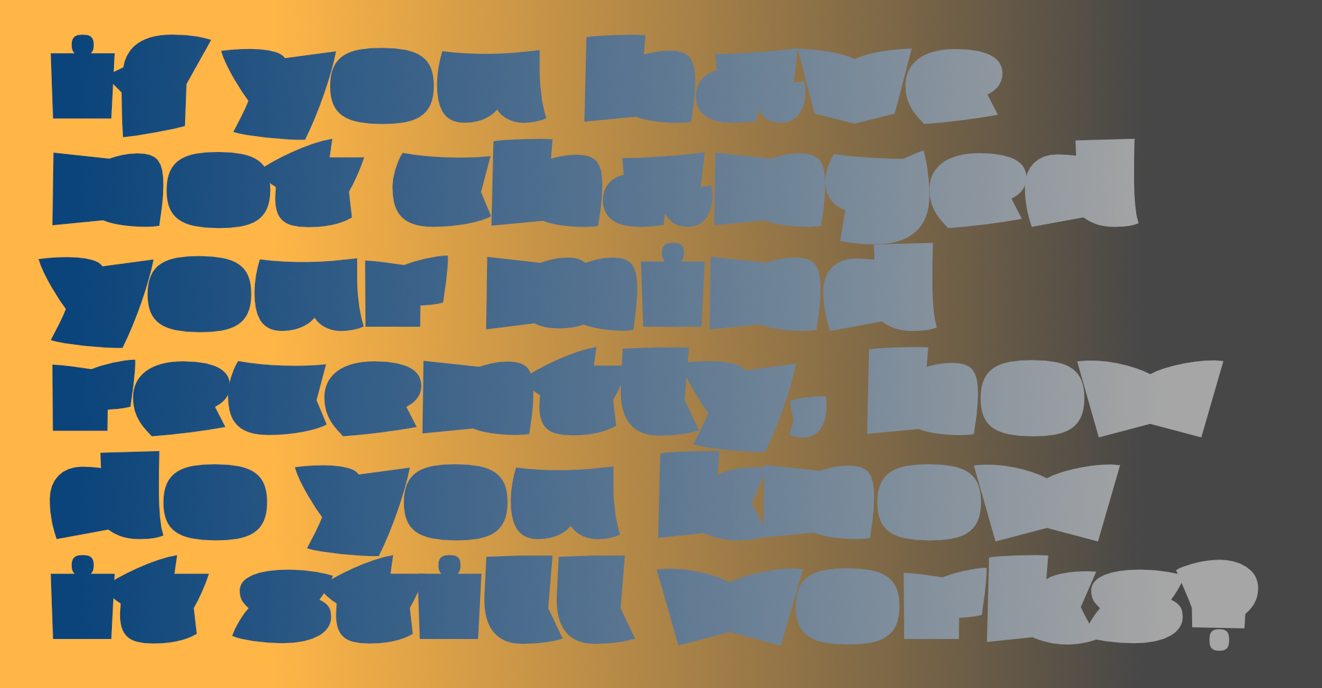
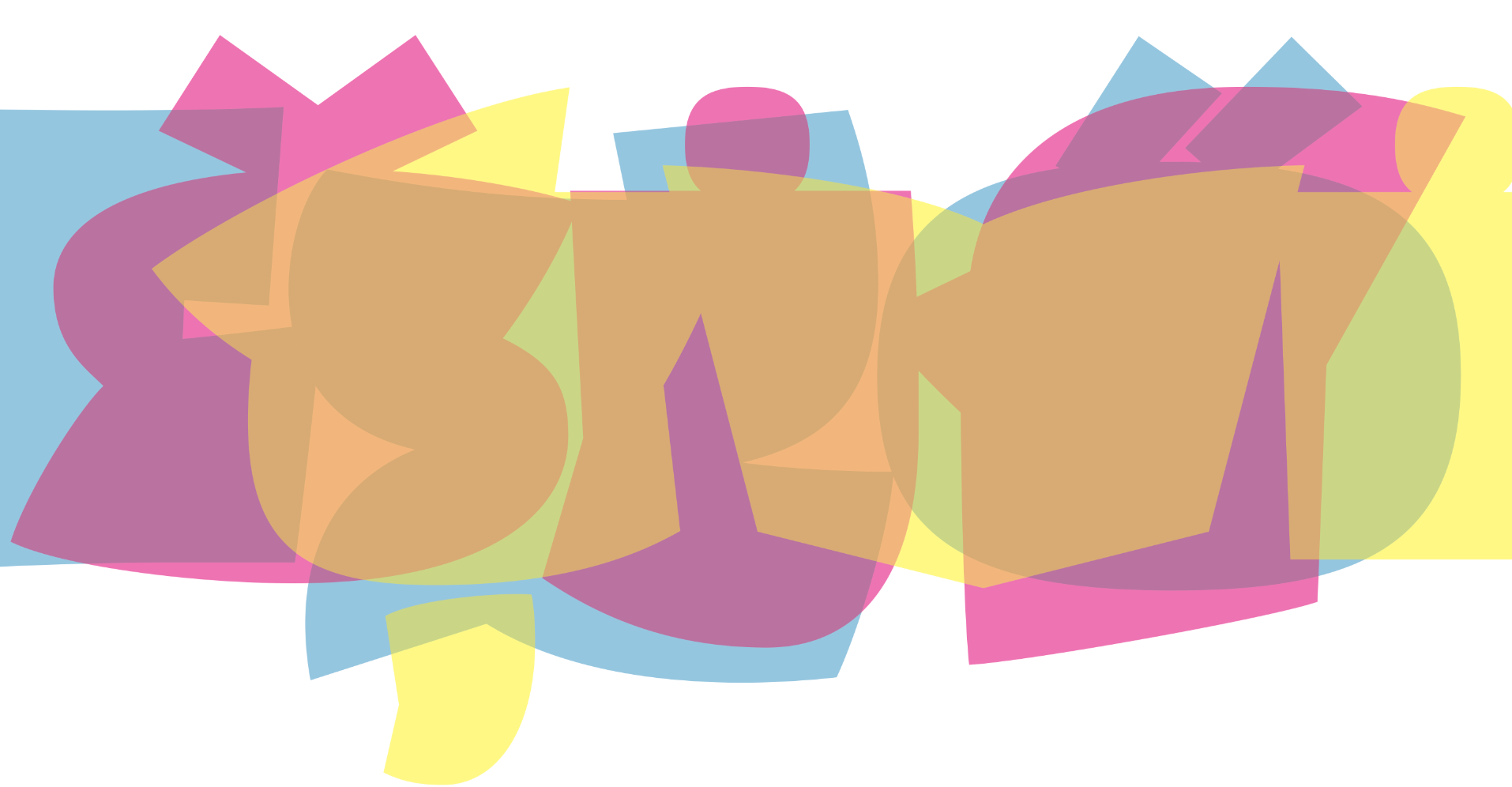
This typeface has me bamboozled to frazzle in attempts to describe it. In trying to fill as much of the available linear space with ink (or pixels [light]), it has become ballooned with squodge (but to avoid the kind of squodge that is evident in Gagarin, or the actual squodge of Squodge,it has been given a few sharp corners). In doing so, it must abandon interior space; so – no counters ¶ some of the shapes incorporate the superellipse, a beautiful shape with a good story attached to it, which I really do recommend you read ¶ I could see it being very satisfyingly cut from metal, but also made into squishy biscuits. I like that the vees – and possibly the EM – look like an opened book; that the kay looks like a churlish crow (or PacMan™ emerging from the bathroom); that the eff looks like that famous criminal penguin with a pompadour in a wind-tunnel; and the asterisk, a lotus blossom ¶ I made a wee viddy that uses it to indulge in a little wordplay.