(nooutline).png?v=63907924051)
The Shapes for Cash Newsletter
1st April 2026
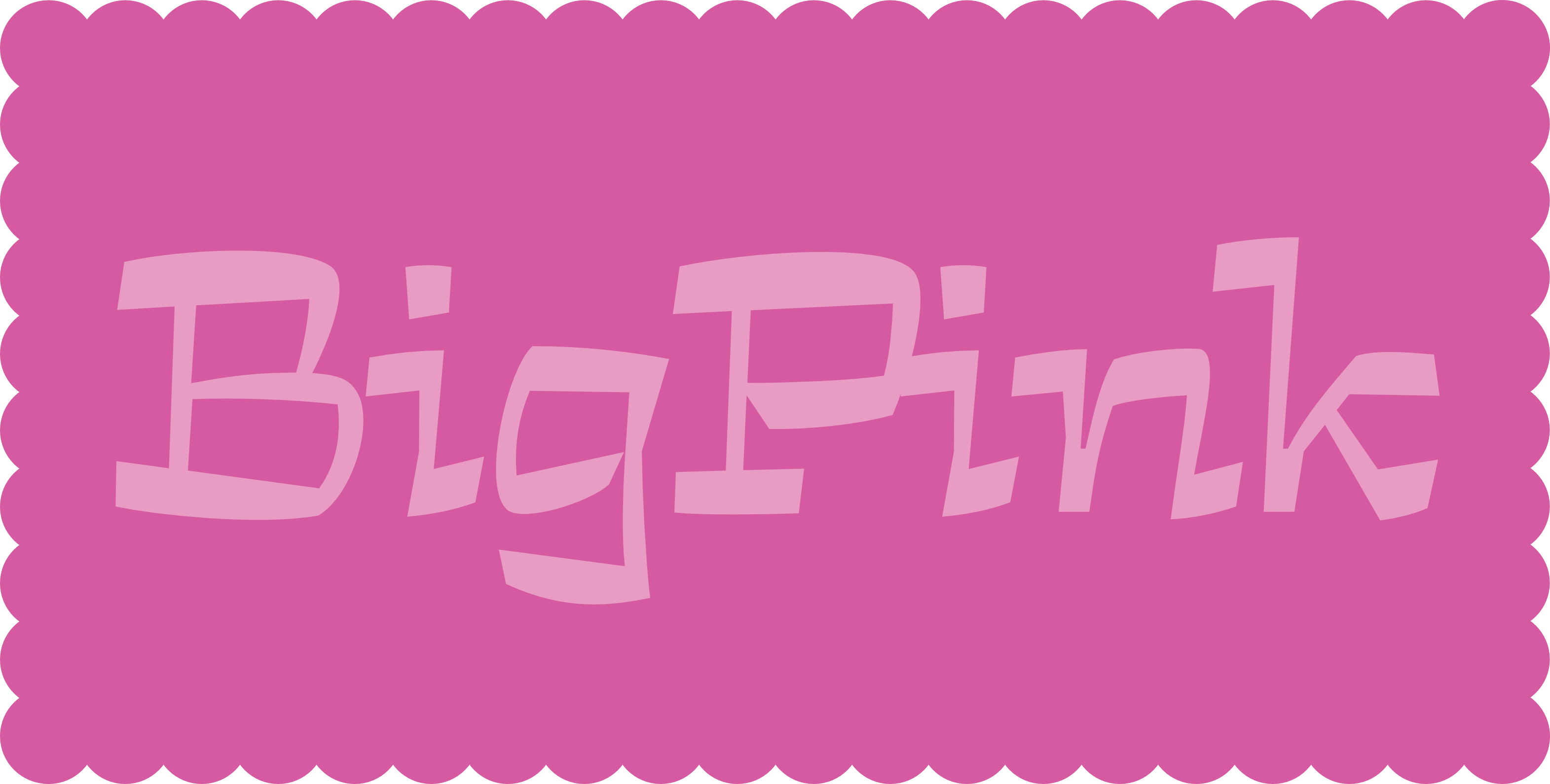
as I was saying†: there was a promise that these newsletters would be infrequent, however, I did not really intend for so much time to pass between them, nevertheless, here we are and I am reassured that I have kept my promise to an impeccable standard, and reasonably happy to be sending out the second Shapes for Cash Newsletter, I hope that I might use it to rekindle some of your interest in my lettershapes ¶ There is a lovely new typeface now, and it is called Big Pink, Yertiz**††**
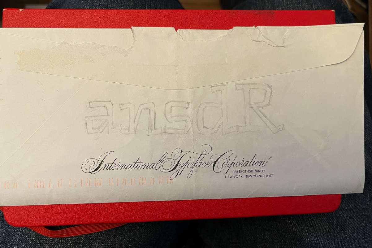
The text on the webpage mentions that it gets its name from a house in which music was made, but I shall not repeat that here for faithful people who have made effort to read this newsletter, I shall instead copy/paste salient fragments of the Wikipedia page, and try to make them seem like my own words ¶ The house is located at 56 Parnassus Lane, in West Saugerties, New York, and in June 1967, Bob Dylan and the musicians who would later become the Band began to record together inside it, particularly in the basement. A painting of the house was used as the cover of the Band’s 1993 album Jericho: unfortunately, the poor timing of this release meant that it was too early to use these inspired letters, and so they had to make do with Carol Twombly’s Lithos ¶ I would like to cast a little light on the genesis of the typeface: this occurred over a long period of time, probably starting with this sketch on the back of an envelope received from The International Typeface Corporation, no doubt containing a letter with details of work to be done on a completely different typeface. Clearly then, these letters began as a displacement activity - an honourable pursuit.
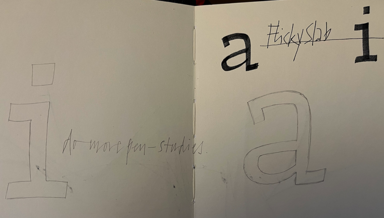
Further perusal of the archive reveals this sketch, which seems to suggest the highly marketable name of “Flicky Slab” and goes on to make the sensible recommendation that I do more pen-studies (and, for some reason: pen-studies is a hyphenated word.)
Well, you might like to know that I did do the pen-studies: the following image shows a pondering of how they might be done with an edged nib; the extreme cant of the pen leaning towards some heavy slab serifs and comparatively thin stems
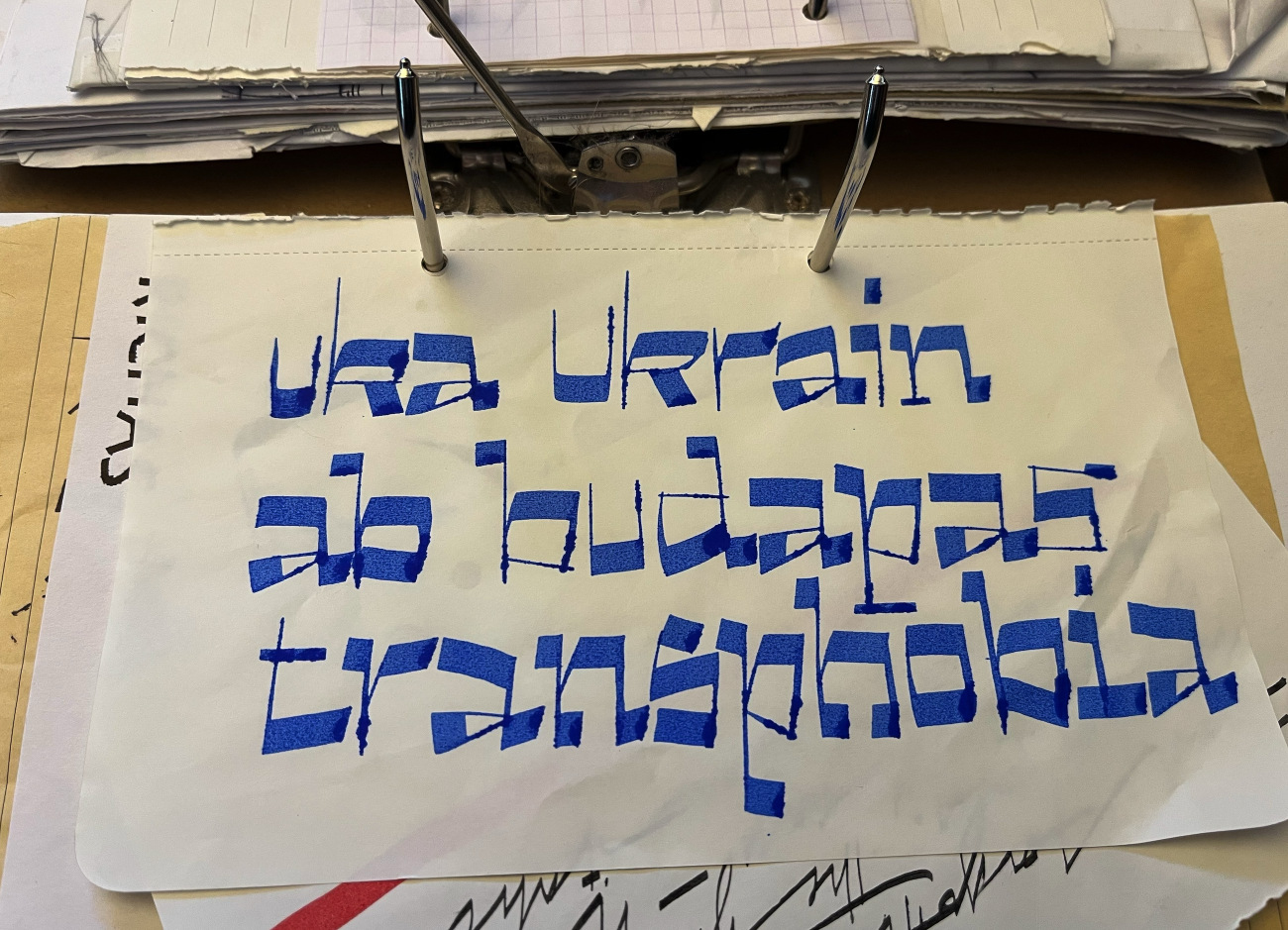
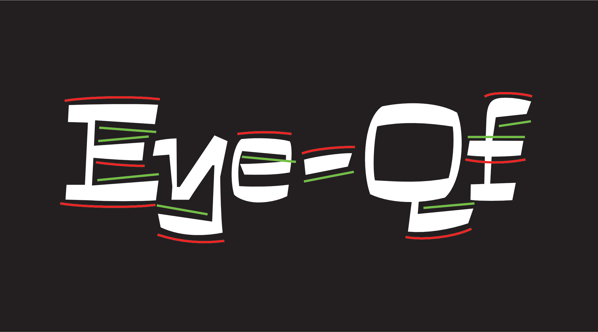
and although the final letters are significantly different to the pencil and ink stages along the way these useful exercises in interpretation eventually led to a notable feature of the design, a stroke that is straight on one side and subtly curved on the opposite, as shown here:
I am afraid that - having now run out of things to say - I must tragically bring this newsletter to a close. Thank you for reading this far (and for being a subscriber). Please go on the site and try out the typeface, maybe type some irreverent phrases about world leaders; look eruditely at all the typefaces; naturally force all your friends to do the same, even if they don’t possess your levels of erudition ¶ I’ll make a wee viddy of two plastic crows viewing the site for promote and show-off purposes, it’ll end up on the Shapes for Cash Instagram.
Ta-Ta: tim
– – – – – – – – – – – – – – – – – – – – – – – – – – – – – – – – – – – –
**†**over a year ago
**††**a Cornish phrase meaning “here it is”